“How long will this bubble last” is a question I receive constantly although lately, the frequency has been increasing. My usual answer is “I am afraid, it is impossible to tell”, however I struggled to remove this thought from my mind so I decided to give it a try and see whether there is a way to calculate how much room central banks, governments and private manipulators still have to make sure the whole house of cards does not fall apart.
Indicator 1: The US Yield Curve
I already addressed the importance of the US Yield curve earlier this week, if you missed here is the article: “THE US YIELD CURVE IS SCREAMING “DANGER!” AND ONCE AGAIN NOBODY IS LISTENING”. Let’s crunch some more numbers today and in particular let’s have a look at how much time did it take for stocks (we will use the S&P500 as a proxy) to start rolling over as soon as the 2y-10y spread in US Treasury yields inverted back to positive. Here are the results:
1990
- 2 April 1990 the curve inverts to positive and starts steepening
- 9 July 1990 the SPX begins to sell-off sharply
Total: 98 Days
1998
- 6 July 1998 the curve inverts
- 6 July 1998 the SPX begins to sell-off sharply
Total: Zero days
2000
- 25 December 2000 the curve inverts
- 29 January 2001 the SPX begins to sell-off sharply
Total: 35 days days
2007
- 28 May 2007 the curve inverts
- 1 October 2007 the SPX begins to sell-off sharply
Total: 126 days
2019
- 19 August 2019 the curve inverts (although the spread was negative only briefly)
- 10 February 2020 the SPX begins to sell-off sharply
Total: 175 days
Putting all together the result is an average of 86.8 days, if we exclude 1998 on the premises markets did not “crash” at that time the result is 108.5 days.
Fast forward to today, the US Yield curve inverted back to positive on the 5th of September, so using the data above we shall expect a sharp correction, that can unfold in a crash, to begin in the period around the 1st and the 23rd of December 2024.
Yes, I am fully aware that from a statistical perspective, the sample is very limited, the reason why this indicator alone is to be taken with a grain of salt and we will see more below. However, considering its consistency proven so far, I recommend not dismissing it so easily.
Indicator 2: The Fed Funds rate cycle.
Let’s repeat the same exercise, shall we?
1989
- 1 June 1989 The Effective Fed Funds rate starts rolling over
- 9 July 1990 the SPX begins to sell-off sharply
Total: 403 days
1998
- 1 September 1998 The Effective Fed Funds rate starts rolling over
- 6 July 1998 the SPX begins to sell-off sharply
Total: Zero days (as a matter of fact the FED cut rates to rescue markets from the LTCM bust and re-inflate stocks)
2000
- 1 December 2000 The Effective Fed Funds rate starts rolling over
- 29 January 2001 the SPX begins to sell-off sharply
Total: 59 days days
2007
- 1 August 2007 The Effective Fed Funds rate starts rolling over
- 1 October 2007 the SPX begins to sell-off sharply
Total: 61 days
2019
- 1 August 2019 The Effective Fed Funds rate starts rolling over
- 10 February 2020 the SPX begins to sell-off sharply
Total: 193 days
Putting all together the result is an average of 143.2 days, if we exclude 1998 on the premises markets did not “crash” at that time the result is 179 days.
Today the effective Federal Funds rate did not start to roll over yet, but assuming it begins next week then a market crash shall be expected in the period around the 8 of February 2025 and the 16 of March 2025. Be careful here, differently from the US yield curve inversion the effective fed funds rate has been far from a consistent indicator to anticipate a market crash. For example in 1995 when the FED cut rates stocks kept rallying. However, we are arguably not in the same situation today. Personally, I do not like this indicator, but if you trust the Fed that much the market will be able to hold these levels for a little longer.
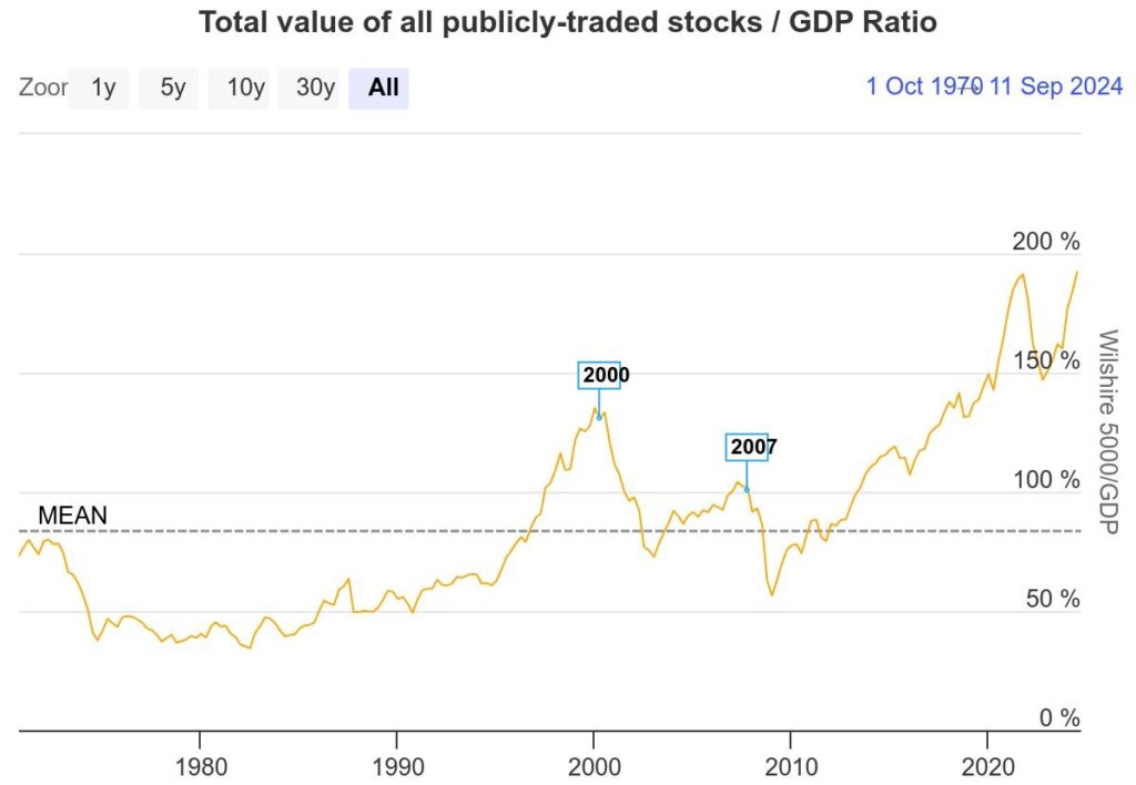
Indicator 3: The Warren Buffett indicator (Wilshire 5000 vs US GDP)
The Warren Buffett Indicator is a valuation metric that compares a country’s total stock market capitalization to its Gross Domestic Product (GDP) to assess whether the stock market is overvalued or undervalued relative to the economy. The indicator is calculated by dividing the total market capitalization by GDP and multiplying by 100. A value above 100% suggests that the stock market is overvalued compared to the economy, potentially signaling a market bubble, while a value below 100% indicates that the market may be undervalued, presenting investment opportunities. Yes, according to this indicator, the market is in a bubble without a shadow of a doubt.
1989
- 1 June 1990 The Buffett indicator peaks
- 9 July 1990 the SPX begins to sell-off sharply
Total: 38 days
1998
- 1 June 1998 The Buffett indicator peaks
- 6 July 1998 the SPX begins to sell-off sharply
Total: 35 days
2000
- 24 March 2000 The Buffett indicator peaks
- 29 January 2001 the SPX begins to sell-off sharply
Total: 311 days days
2007
- 12 October 2007 The Buffett indicator peaks
- 1 October 2007 the SPX begins to sell-off sharply
Total: Zero days
2020
- 10 February 2020 The Buffett indicator peaks
- 10 February 2020 the SPX begins to sell-off sharply
Total: Zero days
From a statistical perspective, we can immediately observe that after the DotCom bubble, the Buffett indicator has been less reliable in anticipating market crashes. Not much surprise here considering how in both 2007 and 2020 the bubble was more homogenous in the market. The case was similar today till 2021 when the Buffett indicator peaked without a market crash being triggered. Why? because after that the Mag7 have been effectively holding the stock market up as a whole leading it to new all-time highs. We are still in the same situation of 2007 and 2021 broadly speaking so this indicator does not give us much of a clue about the timing of a crash anymore (although it is very clear about the size of a bubble markets are currently in).

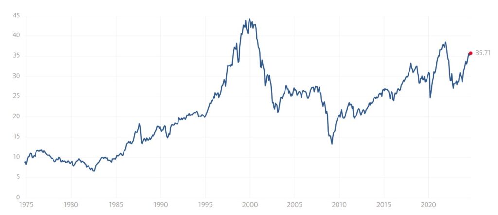
Indicator 4: Shiller PE ratio
The Shiller Price-to-Earnings (P/E) ratio, also known as the cyclically adjusted price-to-earnings (CAPE) ratio, is a valuation measure that compares a company’s or market’s current stock price to its average inflation-adjusted earnings over the past 10 years. Developed by economist Robert Shiller, it smooths out short-term fluctuations in earnings, providing a more stable, long-term view of a stock’s or market’s valuation. A high Shiller P/E ratio suggests that stocks may be overvalued and could be vulnerable to future declines, while a low ratio indicates potential undervaluation and investment opportunities. The ratio is often used to assess market conditions and forecast long-term returns. This index, like the Buffett indicator, is very clear about the fact we are currently in a large bubble, but was it a good indicator to time a market crash? Let’s take a look at it.
1989
- 1 June 1990 The CAPE index peaks
- 9 July 1990 the SPX begins to sell-off sharply
Total: 38 days
1998
- 1 June 1998 The CAPE index peaks
- 6 July 1998 the SPX begins to sell-off sharply
Total: 35 days
2000
- 1 December 2000 The CAPE index peaks
- 29 January 2001 the SPX begins to sell-off sharply
Total: 59 days days
2007
- 1 July 2007 The CAPE index peaks
- 1 October 2007 the SPX begins to sell-off sharply
Total: 92 days
2020
- 10 January 2018 The CAPE index peaks
- 10 February 2020 the SPX begins to sell-off sharply
Total: 770 days
Differently from the Buffett indicator, we notice immediately how this index kept its predictive capability through time, now if we calculate the average as a whole the result is 199 days while if we exclude 2018-2020 when the FED had to quickly revert its rate hike cycle due to the 2019 repo crisis and later on the covid crisis the average is 56 days. Not a great look from a statistical perspective but there is still some value in it. If we consider the latest peak of the index in November 2021 the markets should have started to crash in May 2022. Maybe just a coincidence but that’s the time when Credit Suisse’s troubles, which unfolded in the bank bailout in May 2023, began. If we believe instead the index peaked in July 2024 then we have a window between the 26 August 2024 and the 16th January 2025. Maybe another coincidence again but effectively markets were very close to crashing on the 5th of August

If we objectively put together the information the 3 reliable indicators are giving us all points towards a severe market crash to begin in the first quarter of 2025. Feel free to use this information as you prefer, by definition it is impossible to time the markets and as you know I simply prefer being out of stocks completely.
